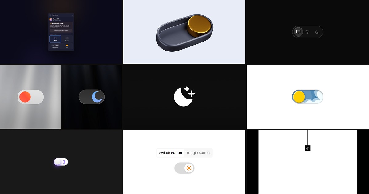
Framer ships light and dark color styles, but it does not ship a visitor-facing toggle — and most hand-rolled solutions flash the wrong theme on first paint or reset when someone returns tomorrow. The best framer dark mode tools wrap Framer’s native tokens with persistence, system-preference detection, and anti-FOUC scripts so published sites feel as polished as the canvas preview.
This list ranks nine theme switchers verified live in July 2026: marketplace plugins and components with working install links, identifiable creators, and clear integration with Framer color styles. Every pick includes a demo or preview you can inspect before publishing — four free and five paid so you can ship dark mode on a client site without a budget line item, then upgrade when custom toggle UI or tri-state Auto/Light/Dark controls matter.
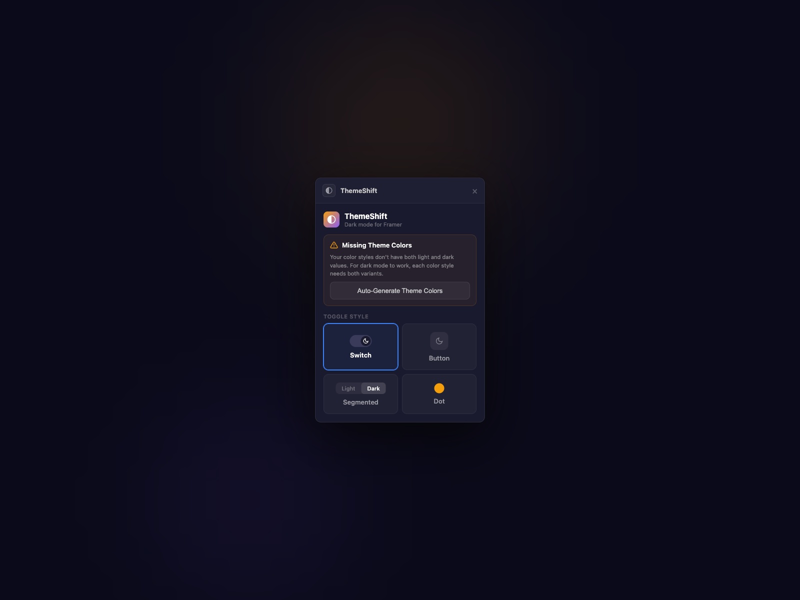
ThemeShift — Zero-flash dark mode plugin with auto-generated dark color variants
by Proofly.ae
ThemeShift from Proofly.ae is the strongest free starting point because it solves the problem most toggles ignore: the white flash on load. It applies the saved theme before the page renders, detects system preference on first visit, and persists visitor choice across sessions — all while reading Framer’s native light and dark color styles. Four preset toggle styles (pill, icon button, segmented control, dot) customize from the property panel, and an auto-generate option creates dark variants when a project only has light tokens defined. Install the plugin, drag the toggle, publish — no head-code copy-paste required.
- Best for
- Agency launches that need anti-FOUC dark mode without pasting head scripts or code overrides
Affiliate link — we may earn a commission at no extra cost to you.
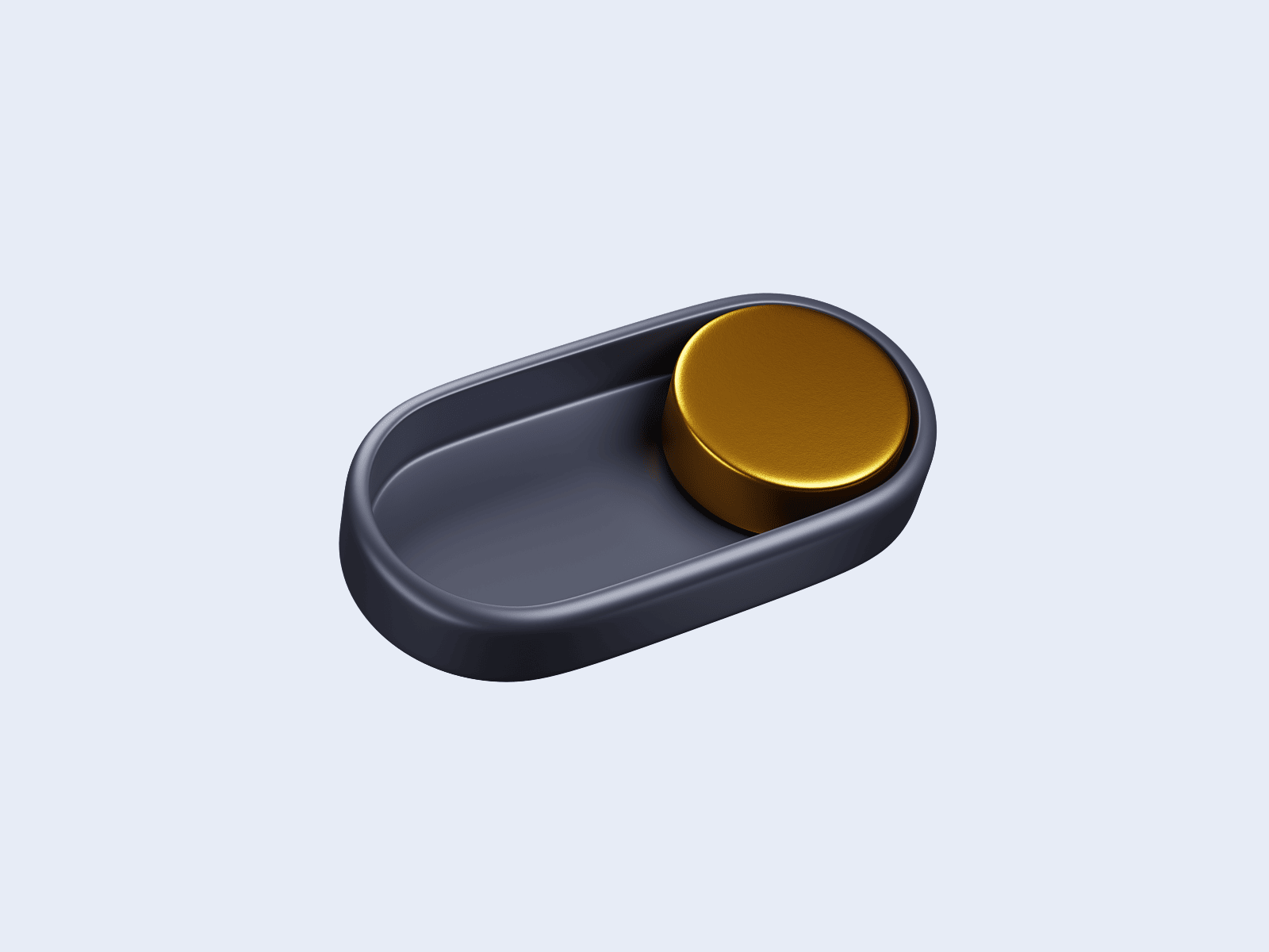
Theme Toggle — Pro theme framework with custom UI linking and Flash Guard anti-FOUC script
by Taha
Theme Toggle v2.0 from Taha targets designers who already built a bespoke light/dark button in Framer and need logic that respects it. Link your own component variants through the property panel and the toggle switches site-wide color styles while syncing variant states on the canvas. A bundled Flash Guard script runs before render to kill FOUC, localStorage persistence survives refreshes, and preset Switch or Button styles ship for fast launches. At 11 USD it is the paid default when ThemeShift’s preset styles are close but the brand guide demands a fully custom control in the nav.
- Best for
- Brand-heavy sites where the toggle must match a custom Framer component, not a preset switch
Affiliate link — we may earn a commission at no extra cost to you.
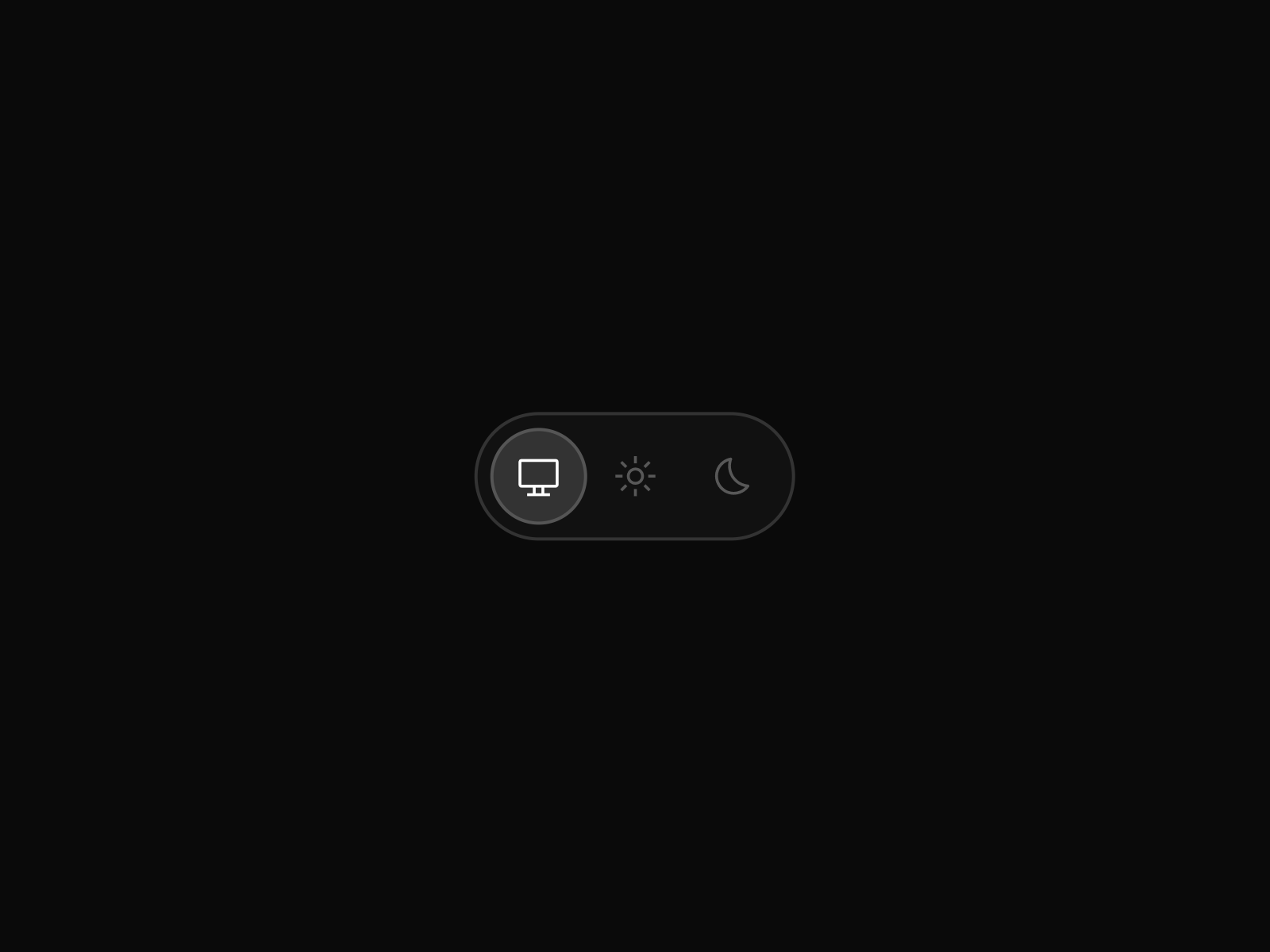
Theme Switcher Pro — Auto, Light, and Dark tri-state switching with custom SVG icons
by Joshua Guo
Theme Switcher Pro delivers the tri-state experience many product sites need: Auto follows the OS preference, while Light and Dark lock a choice until the visitor changes it again. Custom SVG icon pasting, full appearance controls for colors and border radius, and automatic recognition of Framer color styles make it plug-and-play on canvas. At 10 USD from the V2SPACE creator ecosystem, it pairs naturally with other V2SPACE marketplace tools when your stack already includes Charts for Framer or Sync Shopify on the same client project.
- Best for
- SaaS marketing sites where visitors expect system-synced Auto mode alongside manual overrides
Affiliate link — we may earn a commission at no extra cost to you.
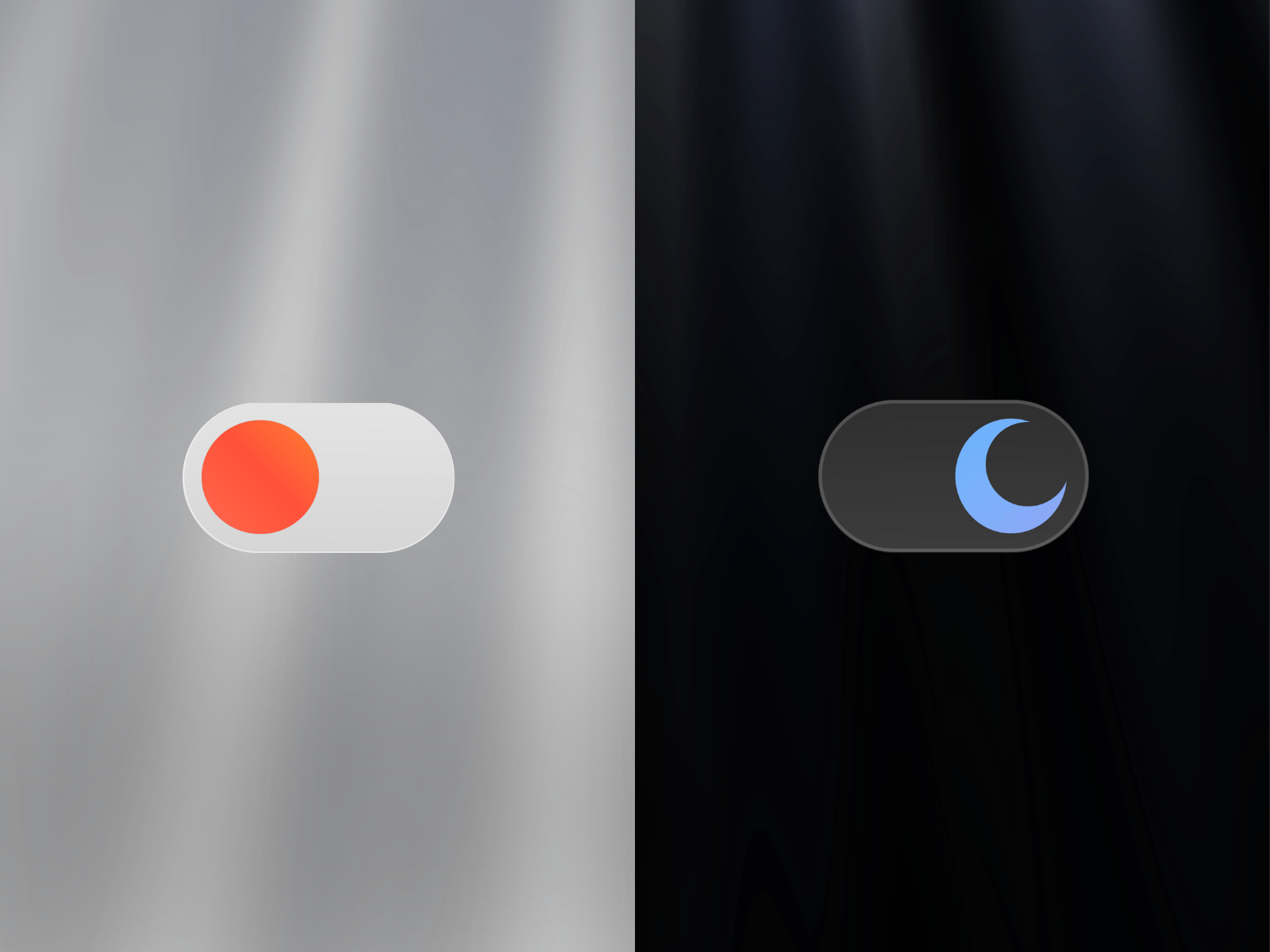
Theme Switcher — Connect your own toggle variants with keyboard shortcuts and optional sound feedback
by Soyeb
Soyeb’s Theme Switcher is built for designers who refuse preset toggle chrome. Create two Framer variants for light and dark controls, link them to the component, and the logic handles persistence, system detection, and zero-flash transitions behind your art direction. Optional keyboard shortcuts, hover-triggered switching, and sound feedback add polish for experiential sites where theme change is part of the interaction design. At 9 USD it sits between free utilities and Theme Toggle when you need custom visuals plus accessibility extras without the v2.0 Flash Guard workflow.
- Best for
- Interactive portfolios and creative studios that want hover, keyboard, or audio-triggered theme changes
Affiliate link — we may earn a commission at no extra cost to you.
Smart Theme Toggle — Animated toggle with optional sound, spring motion, and global theme state
by Mickces
Smart Theme Toggle from Mickces leans into motion and optional audio — spring-powered hover and tap scales, rotating icon transitions, and adjustable sound volume when you want tactile feedback on theme change. It auto-detects system preferences, extracts CSS theme tokens from your color styles, and manages global theme state across the published site. At 5 USD it is the budget paid pick for agencies that need more personality than free switches offer but do not require Soyeb’s variant-linking workflow or Taha’s custom UI mode.
- Best for
- Creative landing pages that treat the dark mode control as a micro-interaction moment
Affiliate link — we may earn a commission at no extra cost to you.
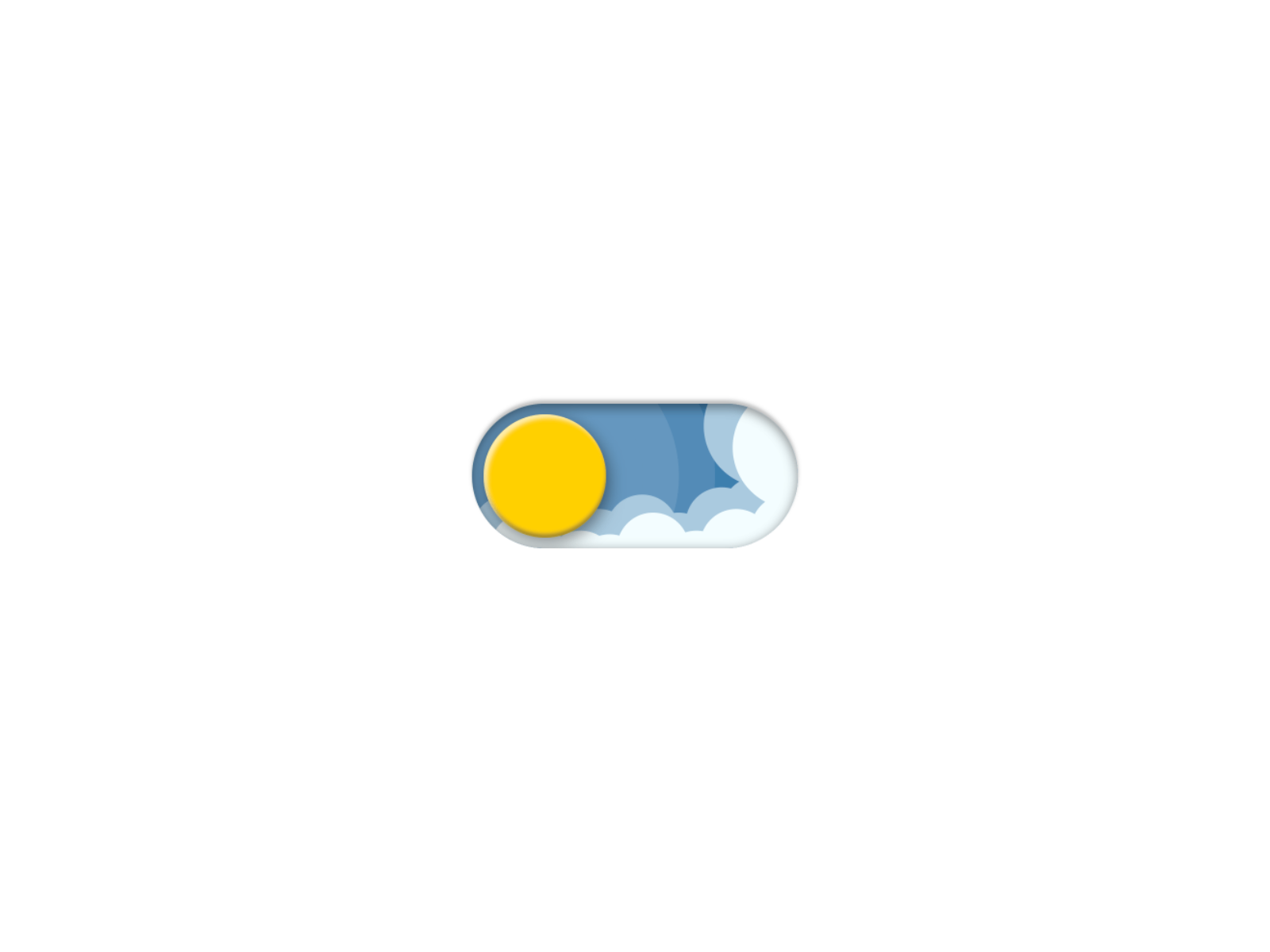
Theme Switch — Light, Dark, and System modes with particle transition effects
by Long Nhật
Theme Switch from Long Nhật is the most complete free component for tri-state control: Light, Dark, and System modes with localStorage persistence and optional particle, cloud, or stars transition effects. Size and shadow adjust from the property panel, and the component writes CSS tokens to the document root so Framer color styles swap globally. Reach for it on internal dashboards or founder sites where ThemeShift’s plugin install is unnecessary but visitors still expect system-aware defaults.
- Best for
- Personal sites and MVPs that need tri-state switching at zero cost with visible polish
Affiliate link — we may earn a commission at no extra cost to you.
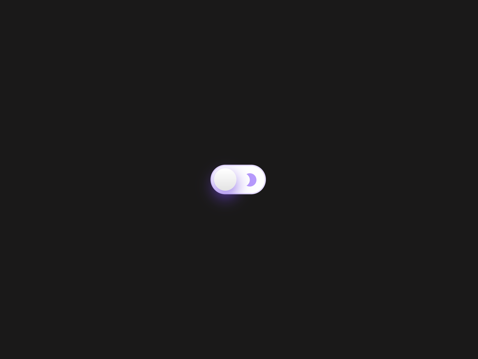
Dark Mode Switch — Spring-physics toggle built by a Framer Expert with global color style binding
by Arsalan Ali
Arsalan Ali’s Dark Mode Switch — branded Eclipse in the listing — uses Framer spring physics for a premium tactile feel on a free component. It binds to global color styles, stays responsive across breakpoints, and avoids layout shift on load. Icons, border radius, and colors tune from the sidebar without code. Certified Framer Expert support is documented in the listing, which matters when a client asks for a small customization on a tight deadline.
- Best for
- SaaS and portfolio nav bars that need a minimal, responsive switch with tactile motion
Affiliate link — we may earn a commission at no extra cost to you.
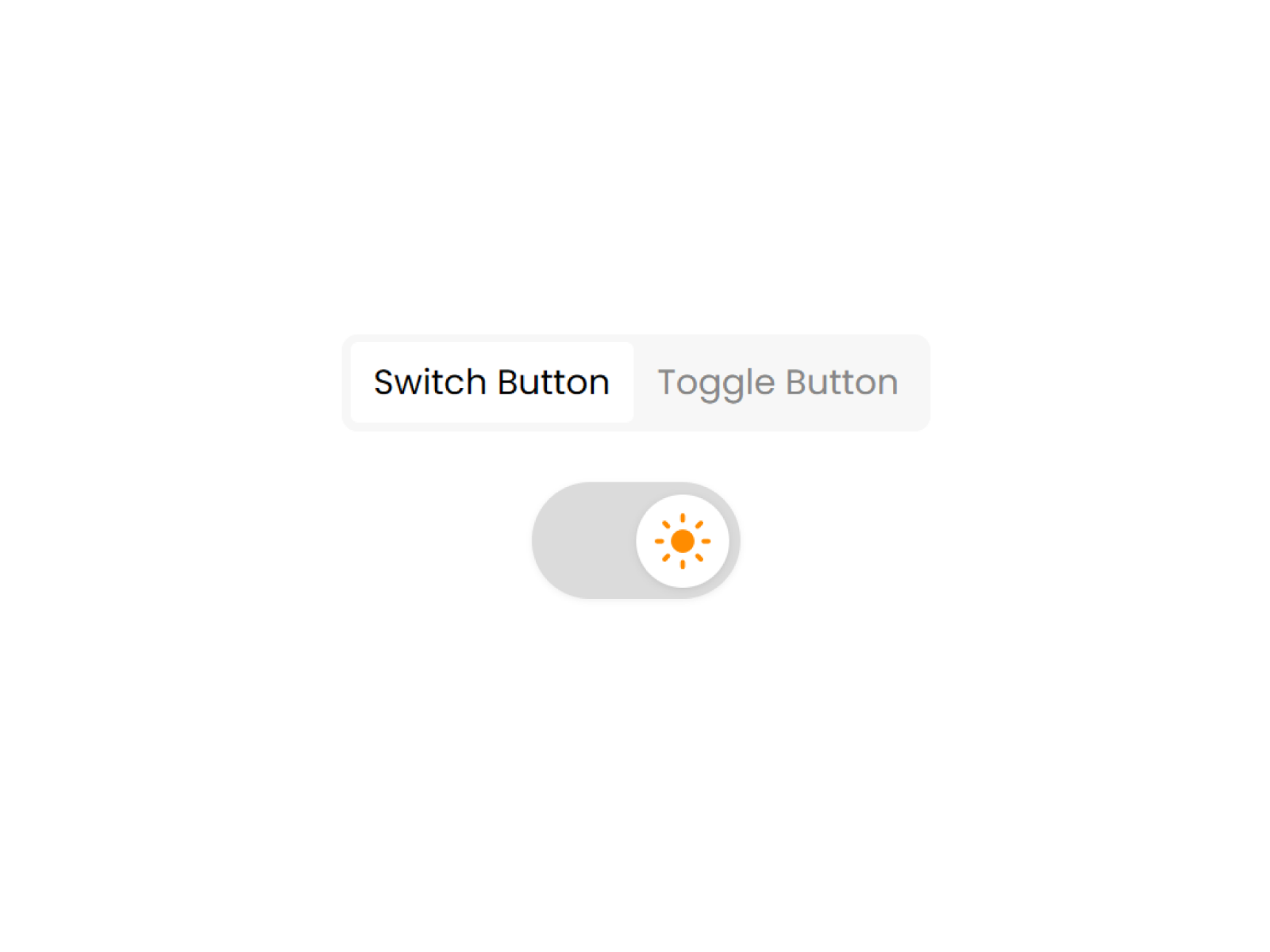
Theme Changer — Button or switch styles with Light, Dark, and System defaults
by Framer Geeks
Theme Changer from Framer Geeks keeps the scope narrow and reliable: pick Button or Switch presentation, set default theme to Light, Dark, or System, and let localStorage remember the visitor’s last choice. Animated transitions ship out of the box, and the component reads Framer’s native theme tokens without custom overrides. Use it when you need a dependable free toggle for a footer or settings panel and particle effects from Theme Switch would distract from a minimal brand.
- Best for
- Quick client handoffs where the toggle style must flip between pill button and iOS-style switch
Affiliate link — we may earn a commission at no extra cost to you.
Spring Switch — Physics-based drag-and-release toggle with custom icon slots
by KIBERU YAHAYA
Spring Switch turns theme switching into a physics interaction: drag and release triggers the color style swap, with slots for custom light and dark handle icons you design in Framer. Position it absolute or fixed so it floats above the layout without consuming nav space — a pattern creative directors use for immersive single-page sites. It requires light and dark color styles defined upfront, which enforces the setup step every tool on this list assumes. Free and recently updated, it closes the list for teams that prioritize interaction novelty over tri-state Auto mode.
- Best for
- Experimental creative sites where the theme control itself is a playful interaction
Affiliate link — we may earn a commission at no extra cost to you.
Quick comparison
| Resource | Price | Type | Best for |
|---|---|---|---|
| ThemeShift | Free | Plugin | Zero-flash dark mode with auto-generated dark tokens |
| Theme Toggle | 11 USD | Component | Custom linked toggle UI with Flash Guard script |
| Theme Switcher Pro | 10 USD | Component | Auto / Light / Dark tri-state switching |
| Theme Switcher | 9 USD | Component | Custom variant linking with keyboard and sound options |
| Smart Theme Toggle | 5 USD | Component | Animated toggle with optional audio feedback |
| Theme Switch | Free | Component | Tri-state modes with particle transition effects |
| Dark Mode Switch | Free | Component | Minimal spring-physics nav toggle |
| Theme Changer | Free | Component | Button or switch styles with system detection |
| Spring Switch | Free | Component | Drag-and-release physics interaction toggle |
How to choose the right Framer dark mode tool
FOUC vs aesthetics. If the brief mentions “no white flash on load,” start with ThemeShift or Theme Toggle — both ship explicit anti-FOUC behavior. Free components like Theme Switch and Dark Mode Switch handle persistence well but may need a head script for pixel-perfect first paint on dark-default sites.
Plugin vs component workflow. ThemeShift installs as a plugin and inserts a finished toggle — fastest for agencies shipping multiple client sites. Components suit designers who want the toggle on the canvas next to nav frames for pixel tuning.
Tri-state Auto mode. Theme Switcher Pro and Theme Switch both expose Light, Dark, and System paths. Pick Pro when SVG icon customization and V2SPACE ecosystem fit the project; pick Theme Switch when free particle transitions matter more.
Custom toggle art direction. Theme Toggle’s linked UI mode and Soyeb’s Theme Switcher variant linking are the paid paths when the toggle is a designed component, not a stock switch. Spring Switch covers the free experimental end with drag physics and icon slots.
Free before paid. ThemeShift alone covers most agency launches at zero cost. Upgrade to Theme Toggle at 11 USD when custom nav components need Flash Guard; Smart Theme Toggle at 5 USD when motion and sound justify a small line item.
Our top pick for most Framer builders
Install ThemeShift first — free anti-FOUC dark mode with auto-generated dark color variants removes the biggest production headache. Add Theme Toggle at 11 USD when the nav toggle must be a custom Framer component with linked variants. For product marketing sites that need Auto/Light/Dark tri-state control out of the box, Theme Switcher Pro at 10 USD is the paid default that matches visitor expectations on SaaS landing pages.
Browse free Framer templates on yoframer for dark-mode-ready starting points, or read our navigation components roundup when the theme toggle lives inside a scroll-reactive header. More curated lists live on the Resources hub.
Updated July 2026. We refresh this list as theme tools ship breaking changes, reprice, or go stale.